BottomNavigationBar(CupertinoTabBar)에서 아이콘에 알림 뱃지 달아야 되는데, 은근 그냥 간단한 작업은 아니였어서 기록.
BottomNavigationBar 아니여도, 알림 뱃지(Notification Badge)를 달 때 따라해도 될 것 같고,
BottomNavigationBarItem 이용하는거니까 Material Style의 BottomNavigationBar든, Cupertino Style의 CupertinoTabBar든 상관 없이 참고해도 괜찮을 것 같다.
시작(기본 코드)
우선 기본적으로 이렇게 생긴 Navigation Bar에서 시작해 보겠다.
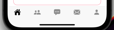
코드는 아래 참고.
class Homescreen extends StatefulWidget {
  @override
  _HomescreenState createState() => _HomescreenState();
}

class _HomescreenState extends State<Homescreen> {
  CupertinoTabController _controller = CupertinoTabController();

  @override
  void dispose() {
    _controller.dispose();
    super.dispose();
  }

  final tabInfo = [
    _TabInfo(
      "Home",
      CupertinoIcons.house_fill,
    ),
    _TabInfo(
      "Friends",
      CupertinoIcons.person_2_fill,
    ),
    _TabInfo(
      "Chat",
      CupertinoIcons.ellipses_bubble_fill,
    ),
    _TabInfo(
      "Message",
      CupertinoIcons.envelope_fill,
    ),
    _TabInfo(
      "Option",
      CupertinoIcons.person_fill,
    ),
  ];

  List<Widget> tabs = [
    // BottomNavBar에서 연결될 각 페이지 5개
  ];

  @override
  void initState() {
    super.initState();
  }

  @override
  Widget build(BuildContext context) {
    return DefaultTextStyle(    // 앱 전체에 기본 적용될 TextStyle.
      style: CupertinoTheme.of(context).textTheme.textStyle,
      child: CupertinoTabScaffold(
        restorationId: 'cupertino_tab_scaffold',
        tabBar: CupertinoTabBar(
          items: [
            for (int i = 0; i < tabInfo.length; i++)
              BottomNavigationBarItem(
                icon: Icon(tabInfo[i].icon),
                backgroundColor: Colors.white,
              ),
          ],
          activeColor: Colors.black,
          iconSize: 27,
        ),
        tabBuilder: (context, index) {
          return CupertinoTabView(
            onGenerateRoute: Routes.generateRoute,
            builder: (ctx) {
              return GestureDetector(
                child: tabs[index],
                onTap: () => setState(
                  () => _controller.index = index,
                ),
              );
            },
          );
        },
      ),
    );
  }
}

class _TabInfo {
  const _TabInfo(this.title, this.icon);

  final String title;
  final IconData icon;
}
기본 알림 뱃지(빨간 점) 띄우기
우선 위쪽 코드에서 이 부분만 떼와서 보여주면서 설명하면 될 듯 싶다.
tabBar: CupertinoTabBar(
  items: [
    for (int i = 0; i < tabInfo.length; i++)
    BottomNavigationBarItem(
      icon: Icon(tabInfo[i].icon),
      backgroundColor: Colors.white,
    ),
  ],
  activeColor: Colors.black,
  iconSize: 27,
),
일단 기본적으로는, Stack을 이용해서 Icon 위에 그대로 덮는 느낌이다.
다른 모양의 Icon에 적용하고 싶으면 Positioned의 right, top 을 입맛에 맞게 조정~
tabBar: CupertinoTabBar(
  items: [
    for (int i = 0; i < tabInfo.length; i++)
    BottomNavigationBarItem(
      icon: Stack(
        children: [
          Icon(tabInfo[i].icon),
          if (i == 3)
          Positioned(
            top: 0,
            right: -3,
            child: Container(
              width: 10,
              height: 10,
              decoration: BoxDecoration(
                color: Colors.red,
                shape: BoxShape.circle,
              ),
            ),
          )
        ],
      ),
      backgroundColor: Colors.white,
    ),
  ],
  activeColor: Colors.black,
  iconSize: 27,
),
이런식으로 구현을 하면, if(i == 3) 으로 조건을 걸어줬으니, 4번째 아이콘에만 빨간 점이 나온다.
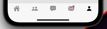
그런데, 오른쪽이 잘려 보인다.
조금 만지다 보니, 대충 BottomNavigationBarItem이 차지하는 크기가.. 핸드폰의 전체 가로 너비를 5등분해서 가져가는 게 아니라, Icon 속성의 크기를 따라가는 것 같았다.
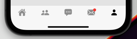
그래서 적당히 Icon에 padding 넣어줘서 해결했다.
물론 늘려준 padding에 따라 Positioned의 top, right값은 조절.
BottomNavigationBarItem(
  icon: Stack(
    children: [
      Padding(
        padding: EdgeInsets.all(10),
        child: Icon(tabInfo[i].icon),
      ),
      if (i == 3)
      Positioned(
        top: 10,
        right: 7,
        child: Container(
          width: 10,
          height: 10,
          decoration: BoxDecoration(
            color: Colors.red,
            shape: BoxShape.circle,
          ),
        ),
      )
    ],
  ),
  backgroundColor: Colors.white,
),
이러면 이제 그럴싸하게 완성됨.
숫자가 들어간 알림 뱃지 띄우기
얘도 크게 다를 바는 없다.
빨간 점 띄워주는 부분만 숫자로 바꿔주면 된다.
TextStyle whiteTextStyle_Bold(double size_) {
  return TextStyle(
    fontFamily: 'GmarketSans',
    color: Colors.white,
    fontSize: size_,
    fontWeight: FontWeight.bold,
  );
}

//-----

int count = 3;

//-----

BottomNavigationBarItem(
  icon: Stack(
    children: [
      Padding(
        padding: EdgeInsets.all(10),
        child: Icon(tabInfo[i].icon),
      ),
      if (i == 3)
      Positioned(
        top: 3,
        right: 3,
        child: Container(
          padding: EdgeInsets.all(5),
          decoration: BoxDecoration(
            color: Colors.red,
            shape: BoxShape.circle,
          ),
          child: Text("$count",
                      style: whiteTextStyle_Bold(11),
                      textAlign: TextAlign.center),
        ),
      )
    ],
  ),
  backgroundColor: Colors.white,
),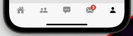
근데 이제 숫자가 두자리 수 까진 괜찮은데, 3자리수로 가게 되면 안 예쁘게 나온다.
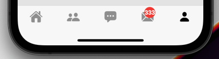
그래서 3자리수(100 이상일 때)는 원 안에 숫자가 아니라 카톡 알림 배지처럼. 동글동글하게 띄워보자.
BottomNavigationBarItem(
  icon: Stack(
    children: [
      Padding(
        padding: EdgeInsets.all(10),
        child: Icon(tabInfo[i].icon),
      ),
      if (i == 3)
      Positioned(
        top: 3,
        right: 3,
        child: Container(
          padding: EdgeInsets.all(4),
          decoration: BoxDecoration(
            color: Colors.red,
            shape: (count > 99)
            ? BoxShape.rectangle
            : BoxShape.circle,
            borderRadius:
            (count > 99) ? BorderRadius.circular(50) : null,
          ),
          child: Text(
            "$count",
            style: whiteTextStyle_Bold(11),
            textAlign: TextAlign.center,
          ),
        ),
      )
    ],
  ),
  backgroundColor: Colors.white,
),
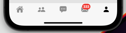
굿. 깔끔하다.
디테일 조정은 원하는대로 입맛에 맞게 하세용.
최종 코드
이제, 만든 뱃지 부분도 함수로 깔끔하게 빼버리고, 999개 이상일 때는 999+로 바꿔 주고, 0개일 때는 뱃지 없애 주는 등 조건도 좀 넣어주고 깔끔하게 코드 정리해 보면~
class Homescreen extends StatefulWidget {
  @override
  _HomescreenState createState() => _HomescreenState();
}

class _HomescreenState extends State<Homescreen> {
  CupertinoTabController _controller = CupertinoTabController();

  @override
  void dispose() {
    _controller.dispose();
    super.dispose();
  }

  final tabInfo = [
    _TabInfo(
      "Home",
      CupertinoIcons.house_fill,
    ),
    _TabInfo(
      "Friends",
      CupertinoIcons.person_2_fill,
    ),
    _TabInfo(
      "Chat",
      CupertinoIcons.ellipses_bubble_fill,
    ),
    _TabInfo(
      "Message",
      CupertinoIcons.envelope_fill,
    ),
    _TabInfo(
      "Option",
      CupertinoIcons.person_fill,
    ),
  ];

  List<Widget> tabs = [
    // 연결될 페이지 5개
  ];

  @override
  void initState() {
    super.initState();
  }

  @override
  Widget build(BuildContext context) {
    int count = 3;

    return DefaultTextStyle(	// 앱 전체에 적용될 기본 teststyle. 필요없으면 이 부분 벗겨내고 사용.
      style: CupertinoTheme.of(context).textTheme.textStyle,
      child: CupertinoTabScaffold(
        restorationId: 'cupertino_tab_scaffold',
        tabBar: CupertinoTabBar(
          items: [
            for (int i = 0; i < tabInfo.length; i++)
              BottomNavigationBarItem(
                icon: Stack(
                  children: [
                    Padding(
                      padding: EdgeInsets.all(10),
                      child: Icon(tabInfo[i].icon),
                    ),
                    if (i == 3) alertBadge(count)
                  ],
                ),
                backgroundColor: Colors.white,
              ),
          ],
          activeColor: Colors.black,
          iconSize: 27,
        ),
        tabBuilder: (context, index) {
          return CupertinoTabView(
            onGenerateRoute: Routes.generateRoute,
            builder: (ctx) {
              return GestureDetector(
                child: tabs[index],
                onTap: () => setState(
                  () => _controller.index = index,
                ),
              );
            },
          );
        },
      ),
    );
  }

  Widget alertBadge(int count) {
    if (count == 0) return SizedBox.shrink();
    return Positioned(
      top: 3,
      right: 3,
      child: Container(
        padding: EdgeInsets.all(4),
        decoration: BoxDecoration(
          color: Colors.red,
          shape: (count > 99) ? BoxShape.rectangle : BoxShape.circle,
          borderRadius: (count > 99) ? BorderRadius.circular(50) : null,
        ),
        child: Text(
          (count > 999) ? "999+" : "$count",
          style: whiteTextStyle_Bold(11),
          textAlign: TextAlign.center,
        ),
      ),
    );
  }
}

class _TabInfo {
  const _TabInfo(this.title, this.icon);

  final String title;
  final IconData icon;
}

TextStyle whiteTextStyle_Bold(double size_) {
  return TextStyle(
    fontFamily: 'GmarketSans',
    color: Colors.white,
    fontSize: size_,
    fontWeight: FontWeight.bold,
  );
}